A placemaking, building identification and wayfinding project for Gallions Housing Association for their Thamesmead high rise tower block properties along Yarnton Way to retrofit and enhance the environment and space – working in collaboration with Urban Initiatives Studio.
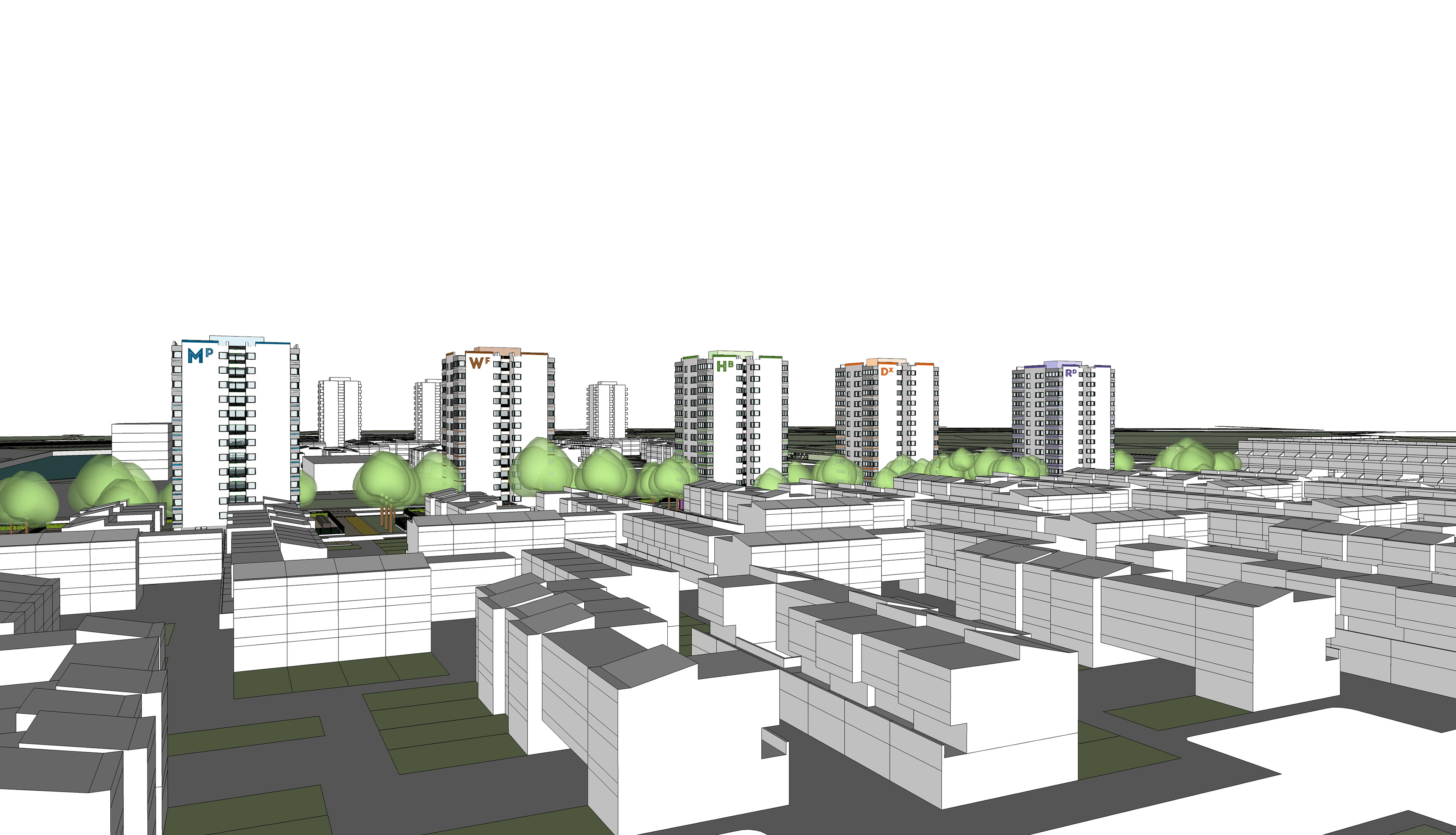
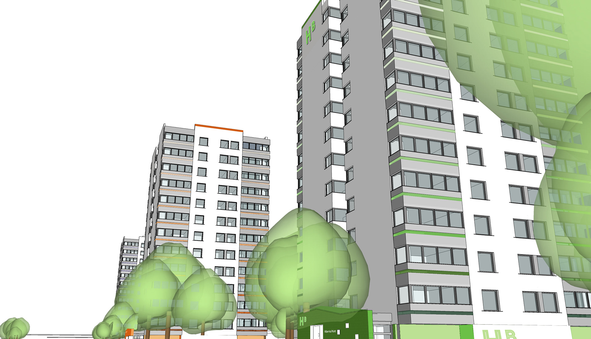
This proposal showed how each of the initial six towers could be identified through the use and development of name style and colour. The design would allow for easy identification and wayfinding viewed from long distances (from Abbey Wood station and beyond for example), mid-range distance (from one end of Yarnton Way) and in moving down the road. The aim was to create clear, distinct building identification within the ‘family’ of the place and scheme to create a co-ordinated, ‘joined-up-thinking’ approach.
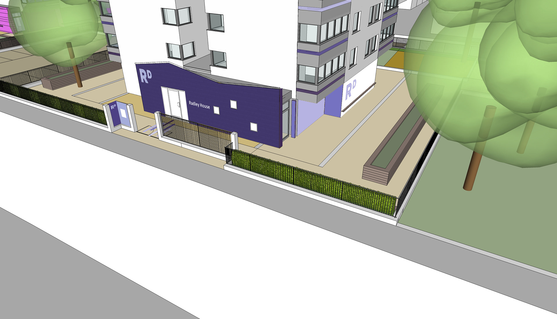
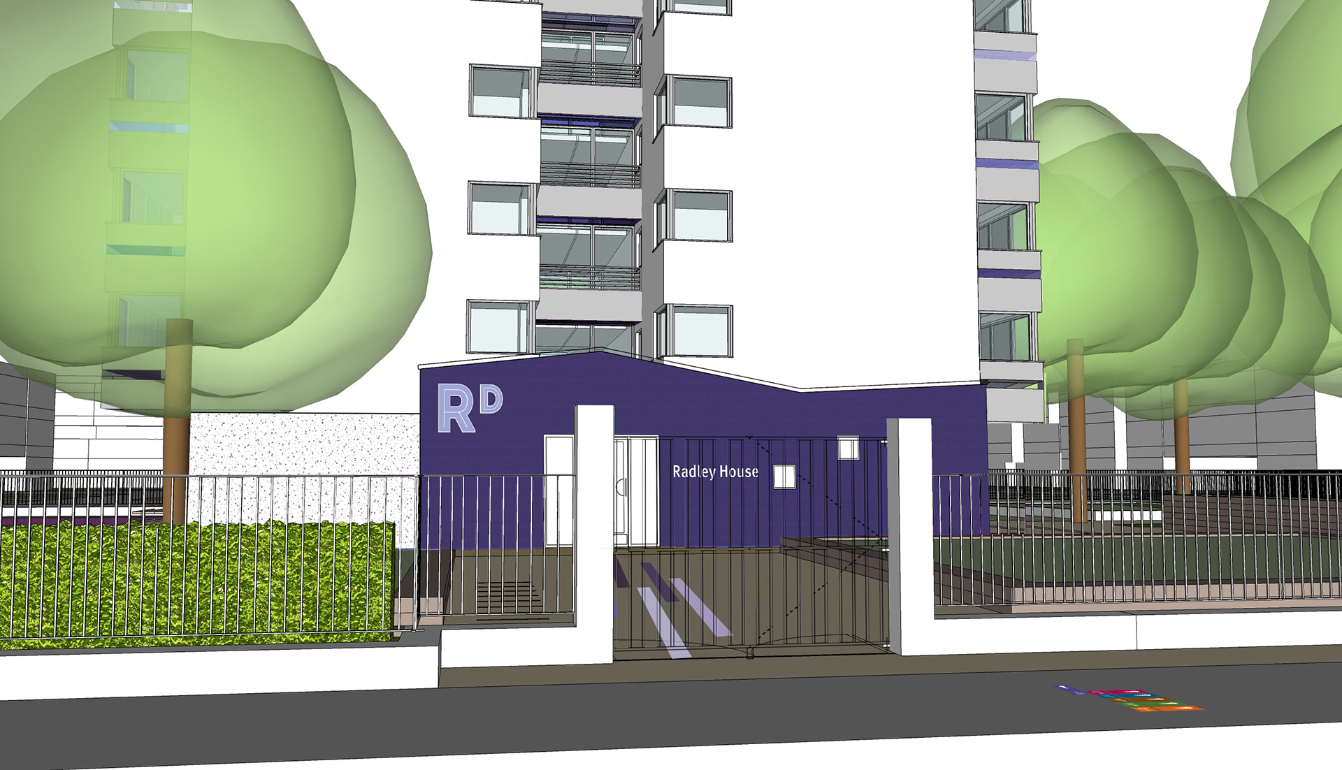
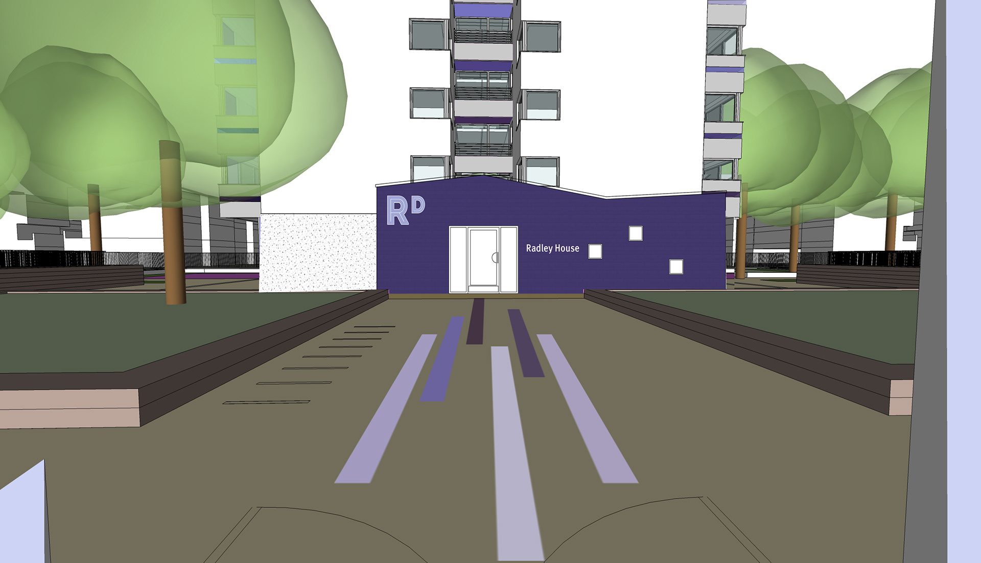
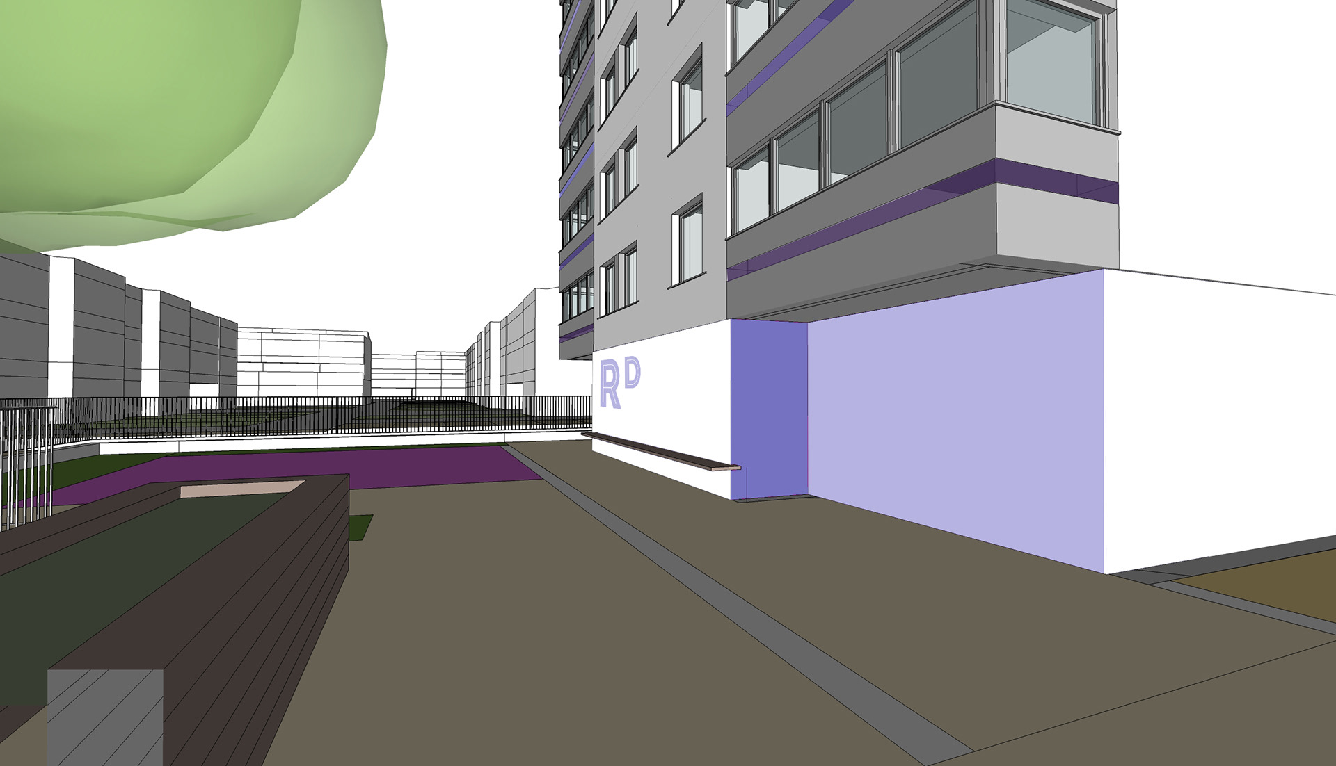
Each building would be designated a key colour which would become recognised as its ‘own’ – Radley House could be identified with the colour purple for example. A complementary palette of colours would be developed to support the buildings key ID colour. This palette of colours would be used on each building in an elegant way to make each tower distinct.
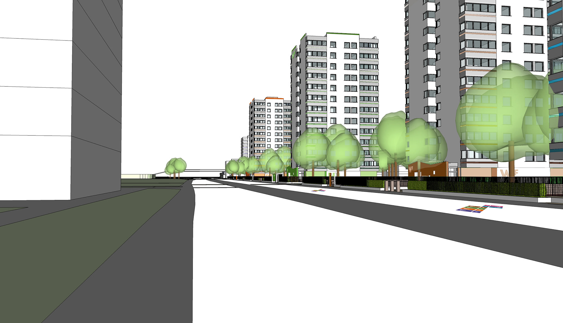
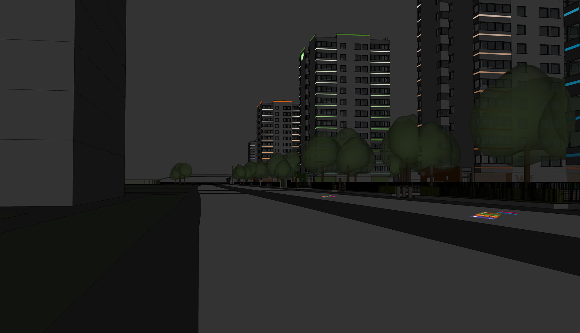
Each entrance (front and back) would also be a ‘marker’ to identify each building – using the key colour across the facia rendered in a textural material (ceramic tiles for example). The ground floor exterior walls will use lighter hues from the palette on designated walls only (other walls following tower colour scheme of white and grey) to create a light approach and drawing the eye to the darker entrance for pedestrian clarity.
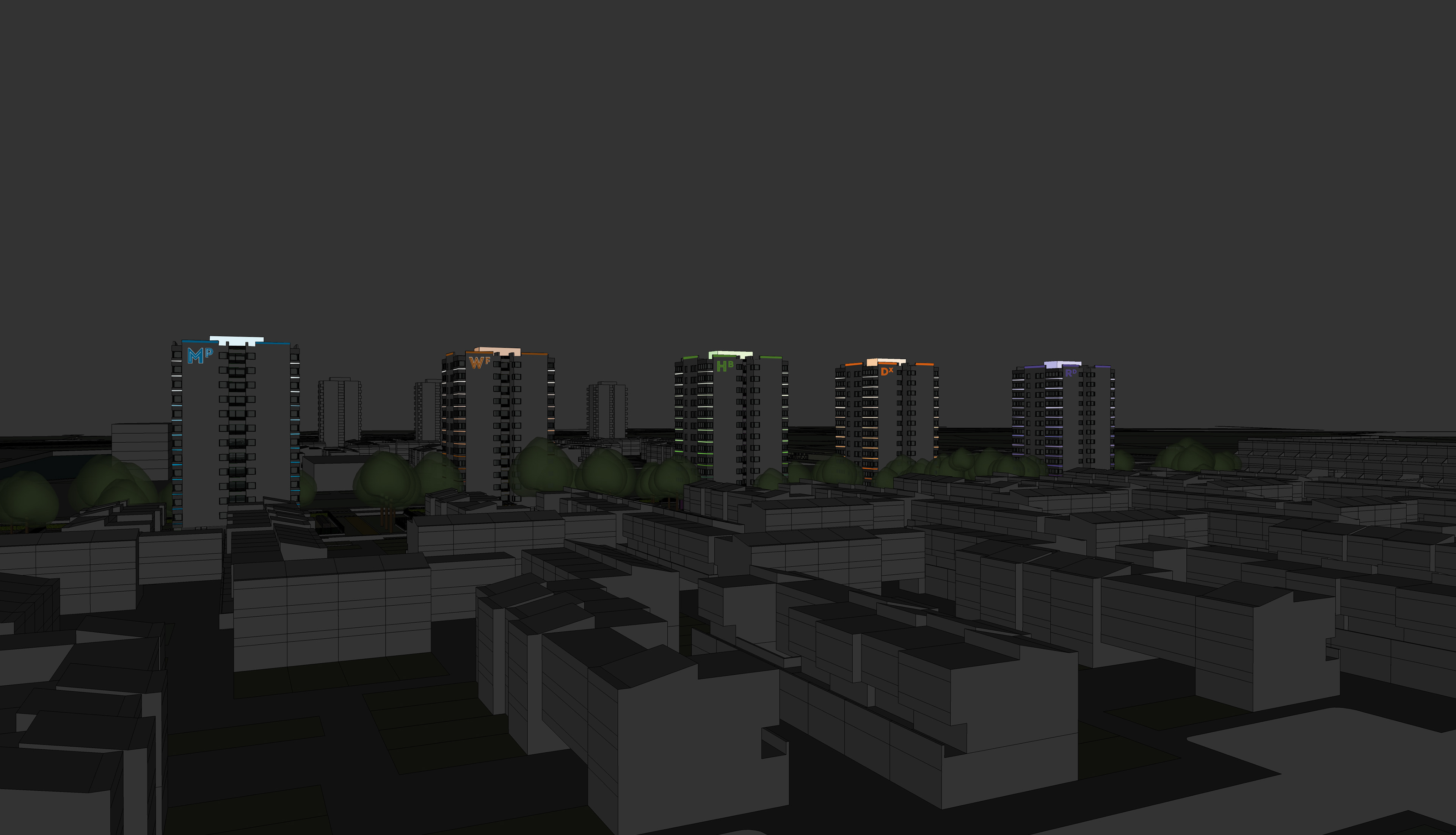
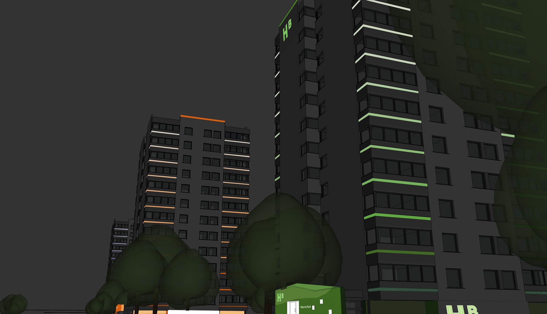
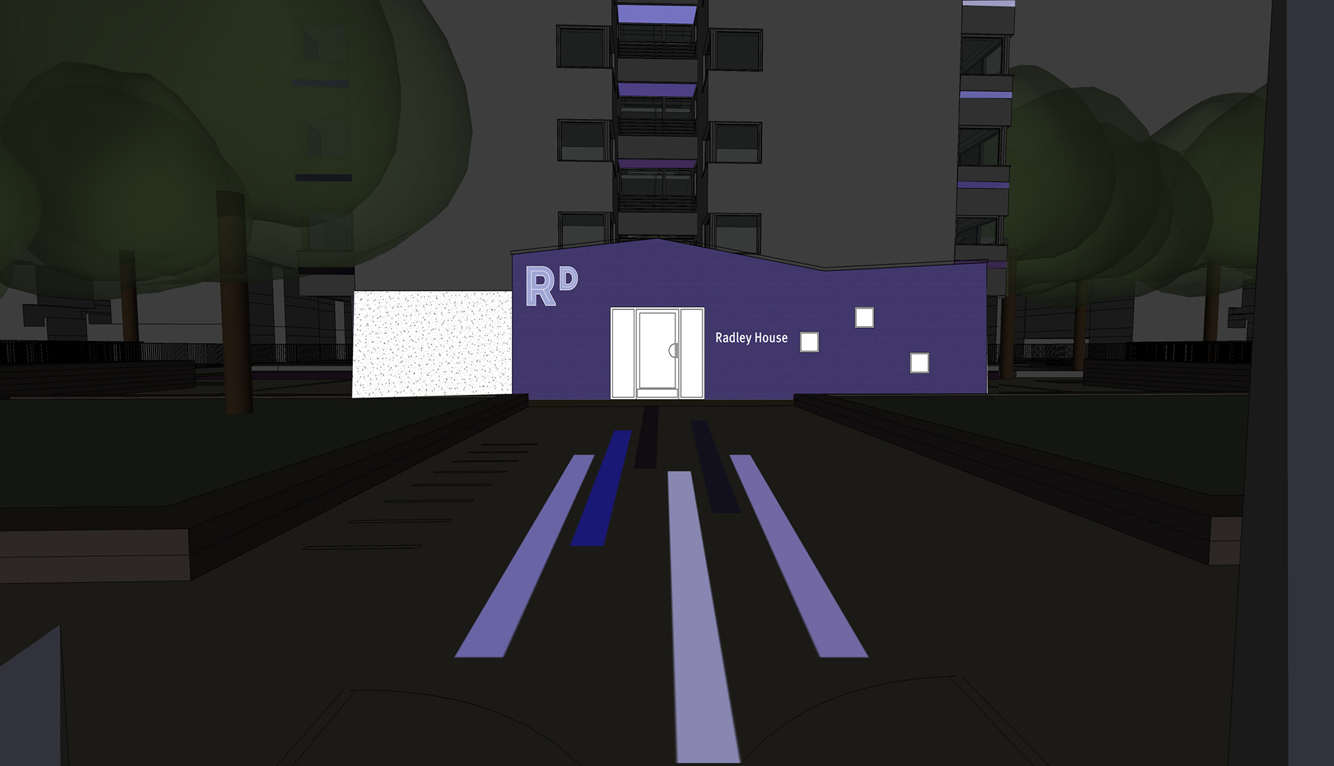
The residential balconies would include a gradient of ID colour ranging from dark at the base to light at the top set into the insets which will have the effect of accentuating the rising tower. Viewed clearly in daylight, these would also be lit at night creating a linear gradient design with strong impact. Both in the day and night, these inset colours would be a feature that support the ID and wayfinding strategy of each tower and place.
The design follows-through for the community balconies on the front and back of the buildings where the balcony soffits would be painted in the same colours and hues as the residential balcony insets. These would also be gently and simply lit at night to create a similar effect. Further to these features the proposal suggests lighting the top of the building with a thin band of light in the key colour along with illuminating the lift housing to ‘finish’ and define the building roof.
Each building would be identified by its name and a ‘monogram’ design created from two letters of the name – Radley House = RD for example. The monogram would act as a symbol and reference for each building supported with the use of the key colour. The design proposes that the monogram be used in the following places:
• Top of building front and back – 3D fabricated construction in building key colour, lit at night
• Top left of entrances – to be complementary to entrance facia material, robust and designed to minimise potential vandalism
• Ground floor walls – painted in light palette colour on white wall
• Side of canopy on back entrance (possibly lit)
• Gateway and gateway columns
The names of each building would be spelt out and set elegantly at each entrance using a modern contemporary font for good legibility and with qualities of being ‘friendly’ and accessible.
The place ID and building(s) location would be supported with an elegant wayfinding/signage system set into ground paving. Using key colours of each building and monogram design, a system that has clarity and defines building location and direction could be developed. This approach began to link the towers and create a sense of the ‘greater’ scheme.
All of the branding and wayfinding components of the scheme was considered with thoughts of creating design that has a ‘light touch’ to complete an overall effect that had synergy, meaning and clarity.