A new brand identity to replace the previous visitor economy arm of Worthing Borough Council which was branded as ‘Visit Worthing’.
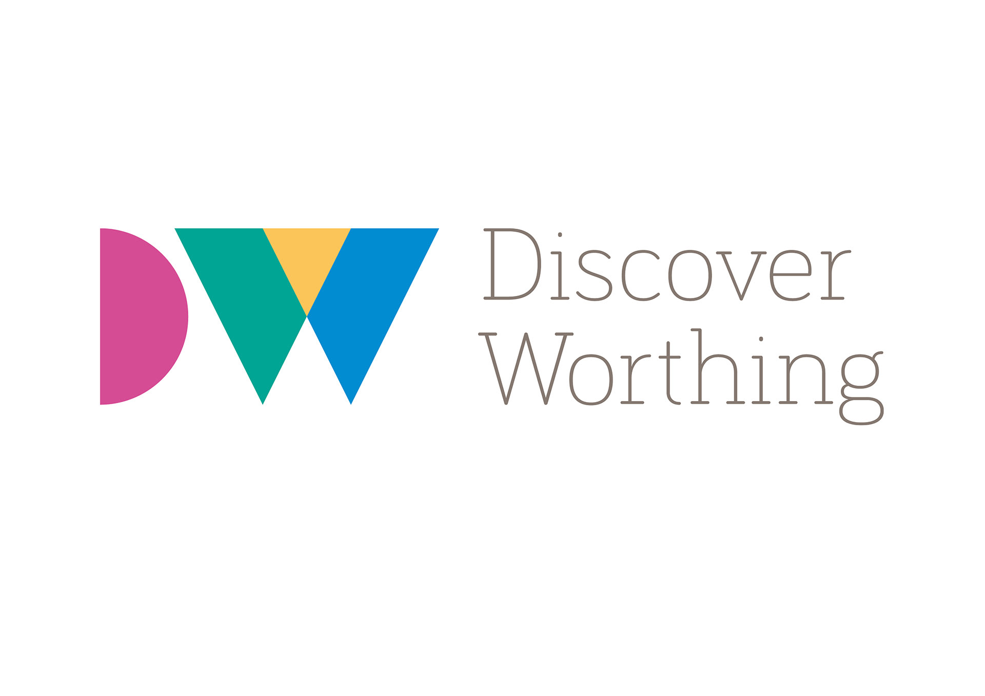
‘Discover Worthing’ a more positive, pro-active name was agreed for the town which now reflects Worthing’s changing visitor offer and aspirations for the future. The Discover Worthing identity has been designed to reflect the ambition of place – to be colourful, fun, mature, cultural, contemporary and welcoming.
The project required:
• Analysis of existing tourism marketing and visitor information activity currently undertaken by the Council.
• Consideration to context and how it fits within wider strategic projects such as Coastal West Sussex and West Sussex Weekends which provide umbrella platforms for thematic marketing across Sussex, as well as fit with the Council’s own developing visual identity.
• Workshop and feedback questionnaire with the economic town community to help determine their thoughts on what is/was Worthing’s persona.
• Design and development of a versatile logo and strong brand identity which can be used across the board on all online and offline visitor marketing materials including a new website, social media, printed marketing collateral and large-scale advertising.
• The writing and design of a guidelines manual for use by the Council, partners and outside organisations.
The identity elements allow for maximum flexibility in design with the expectation that each application will be created to a high standard, maintaining the ‘spirit’ of the brand and be well-designed.
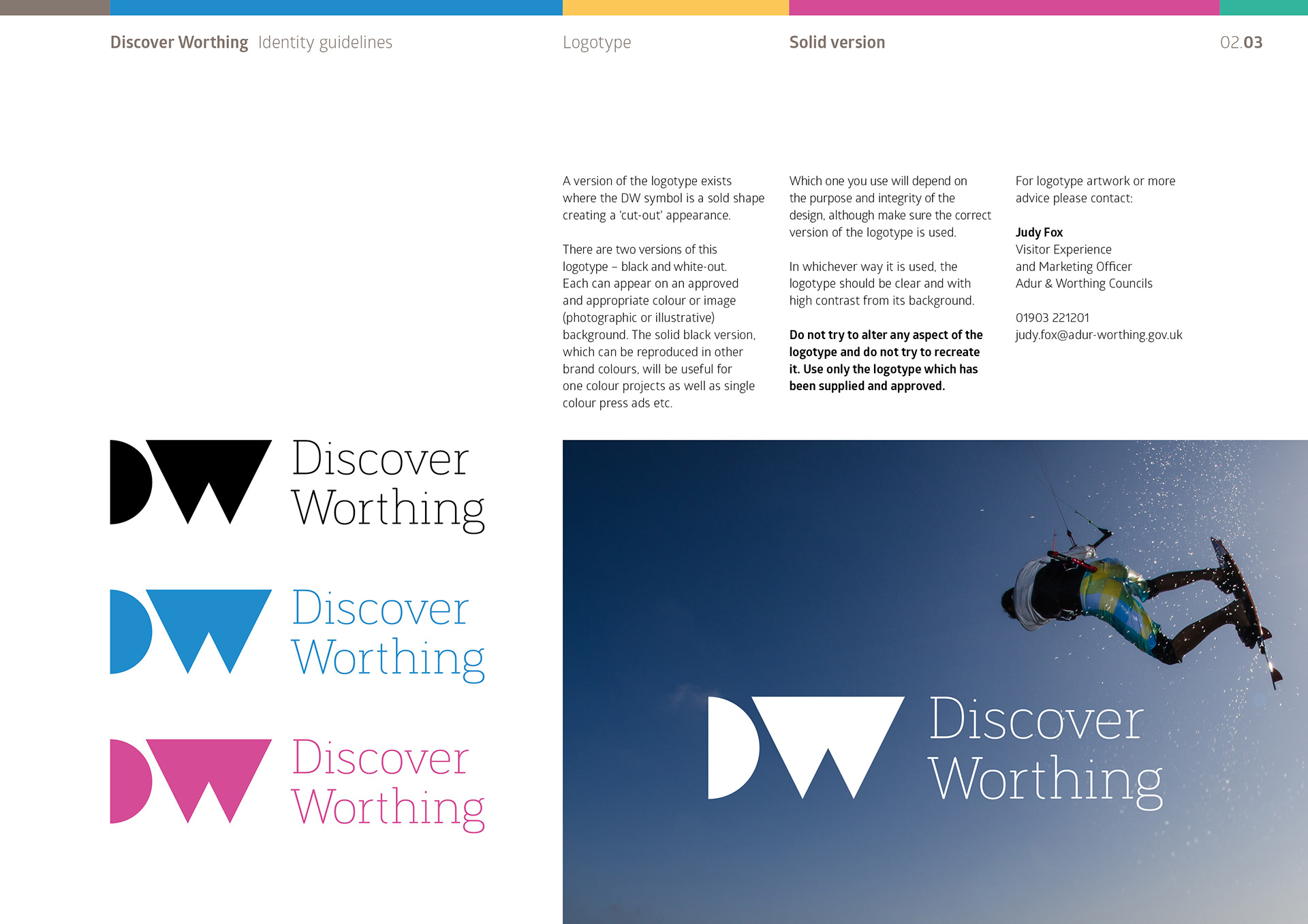
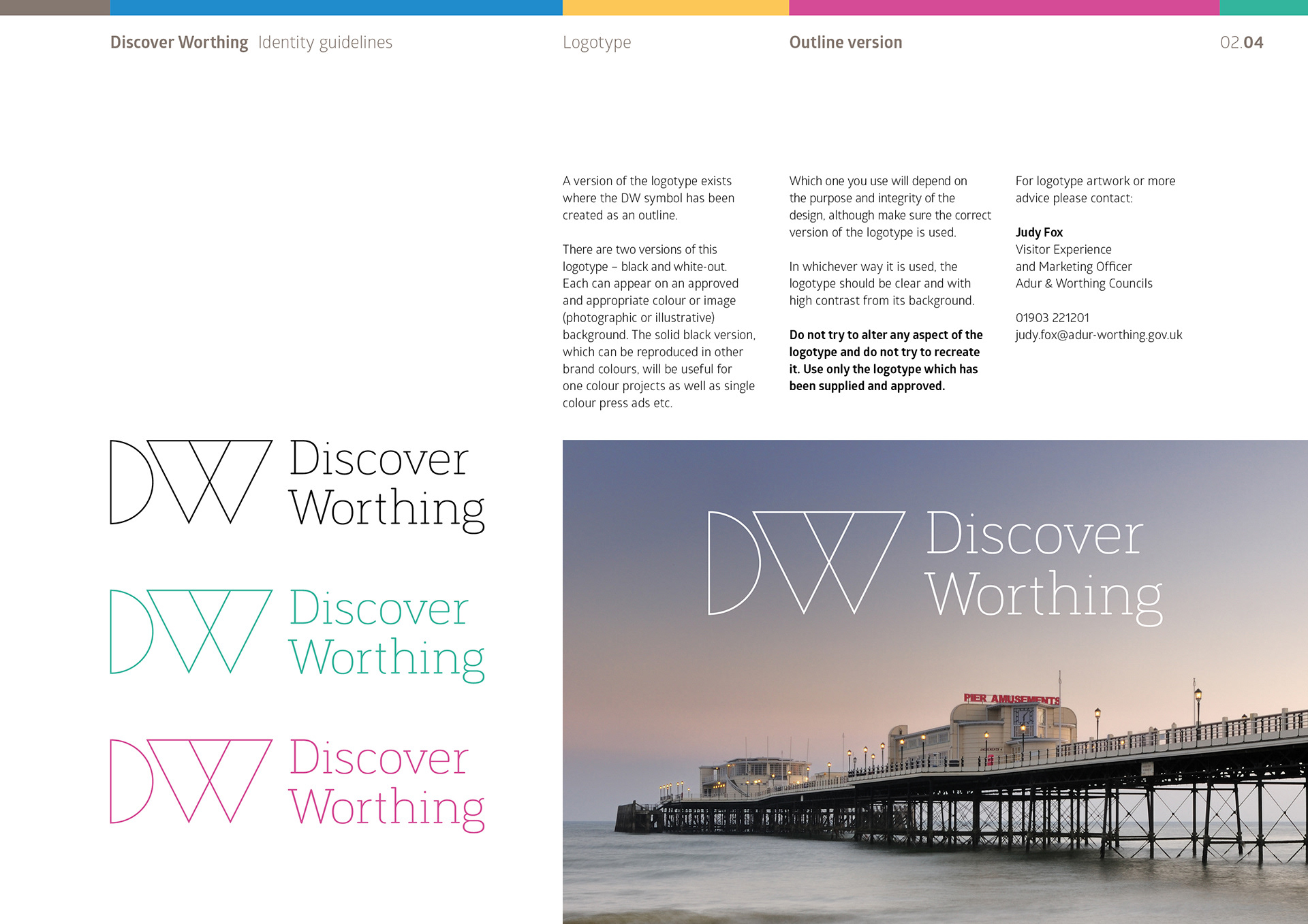
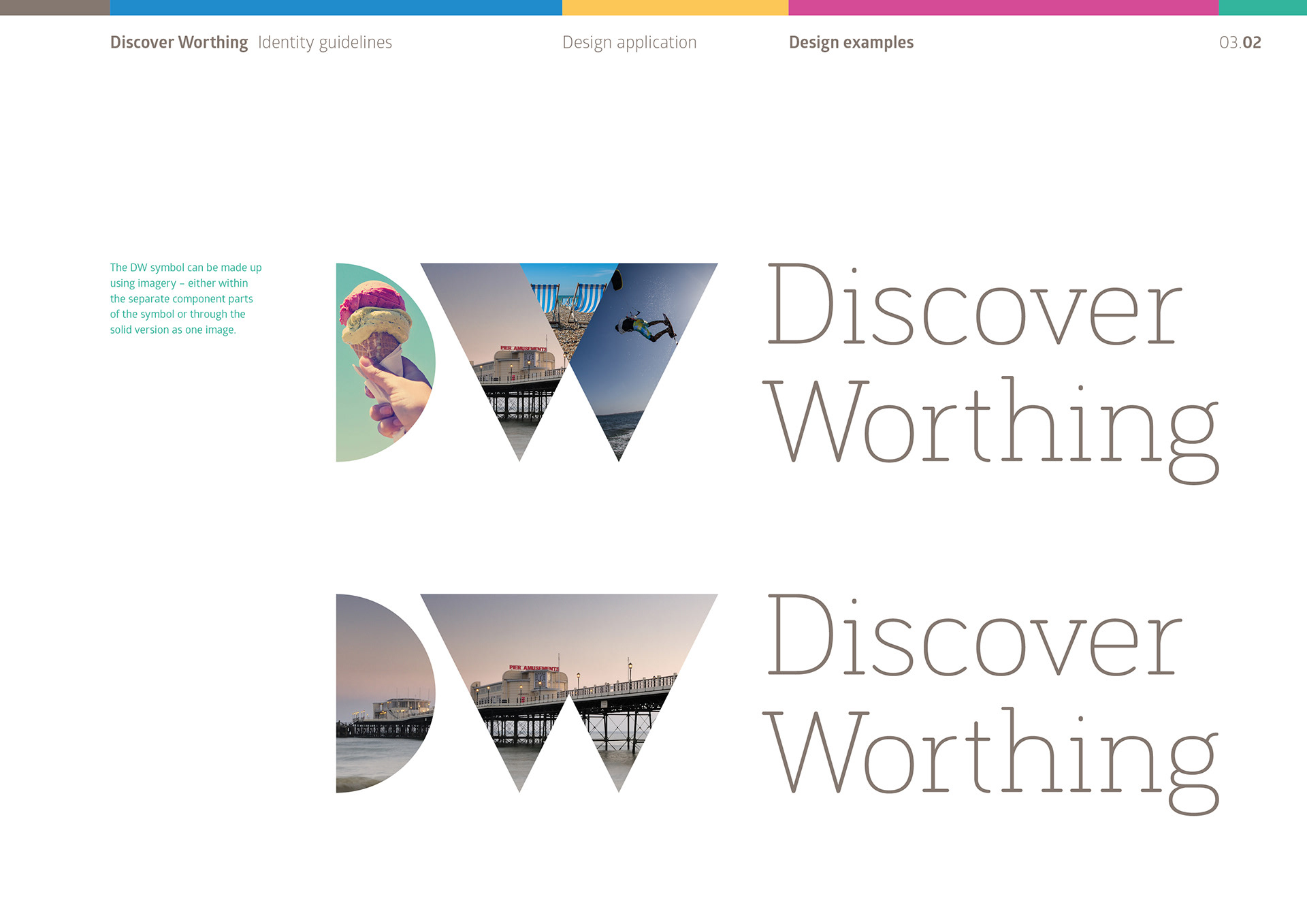
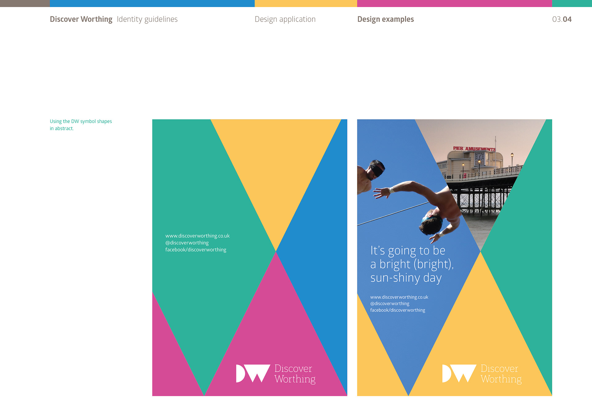
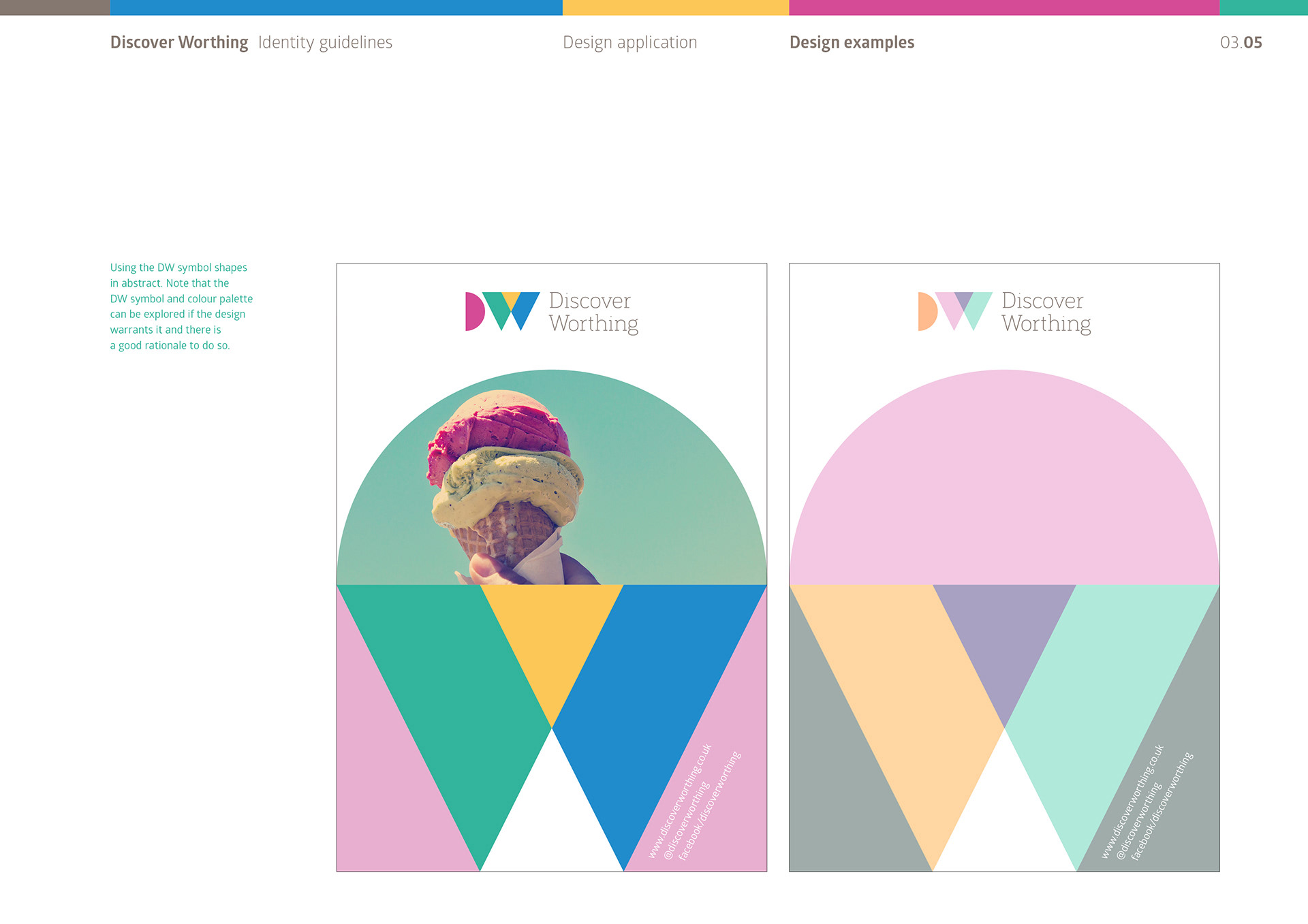
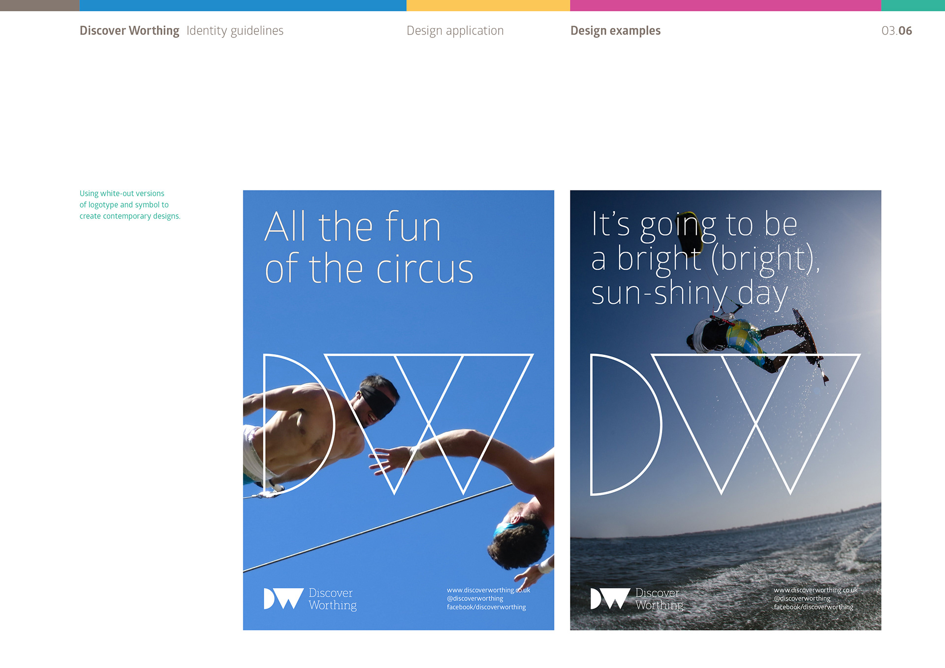
Along with the ‘parent’ version of the logotype, other versions were designed to create an element of flexibility and fun. These included a version where the DW symbol is a solid shape creating a ‘cut-out’ appearance and a version where the DW symbol has been created as an outline. A version where the DW symbol can be made up using imagery – either within the separate component parts of the symbol or through the solid version as one image was also created.
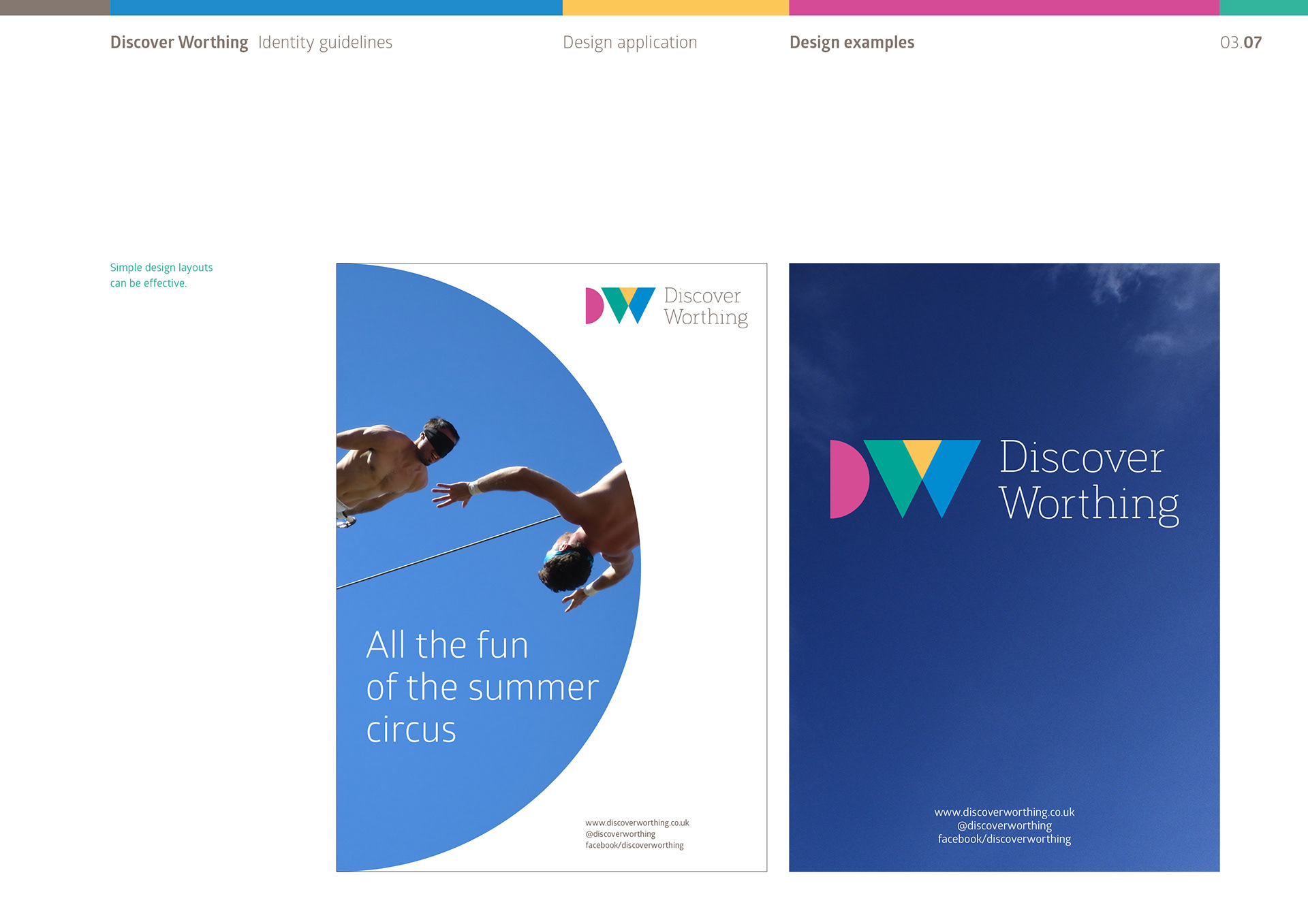
Instructions to be creative and look to find ways in which communication materials could stand-out and inform, and where the DW symbol can be used to create abstract designs that are striking and modern, along with good use of imagery and well-balanced typography are encouraged.
The guidelines demonstrated design examples as well as informing on more technical instructions such as logo versions, colour palette with digital and print colour specifications, fonts, minimum white space and photography style preferences.
The new identity was launched in June 2017.