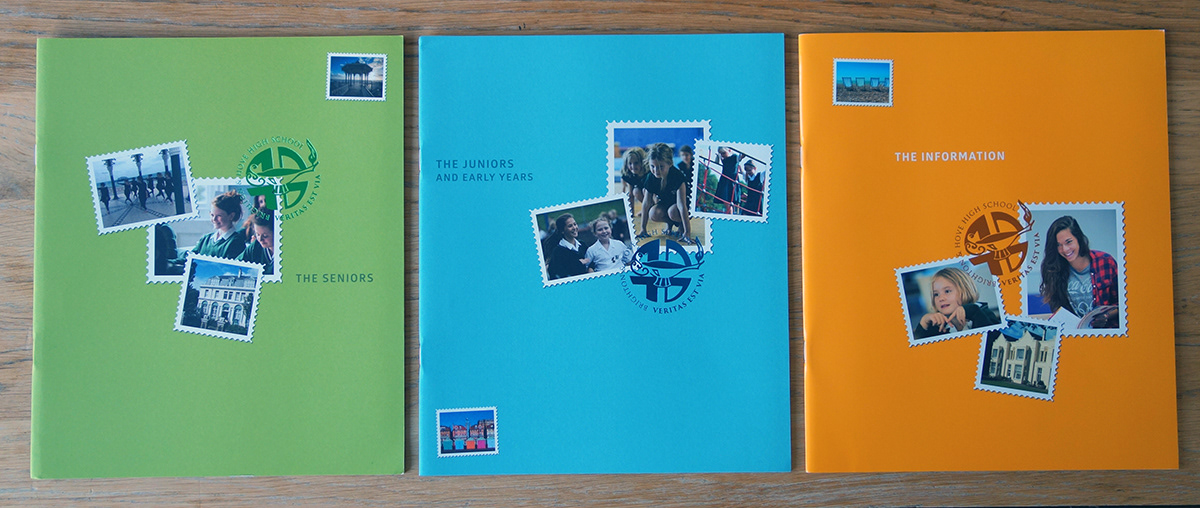
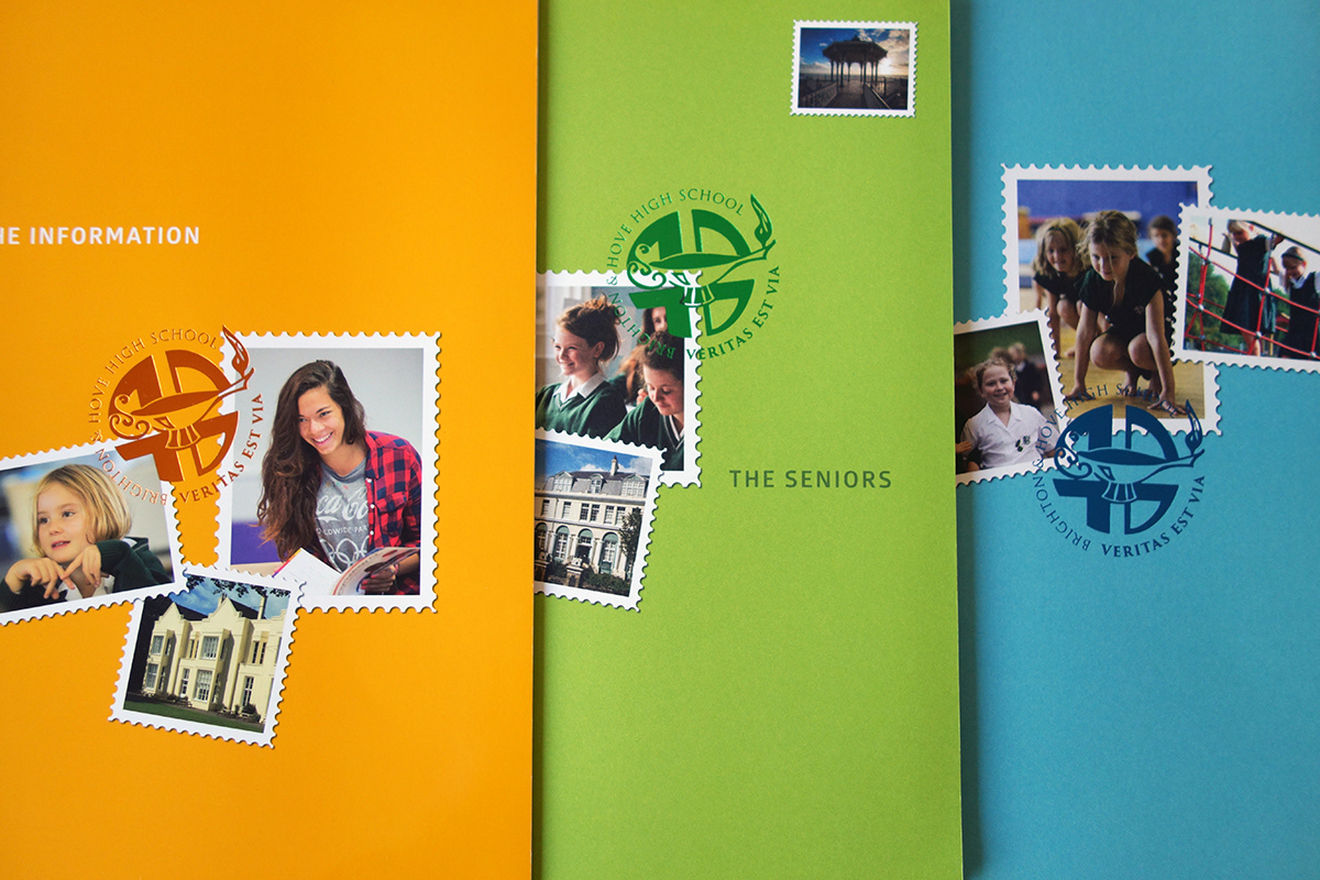
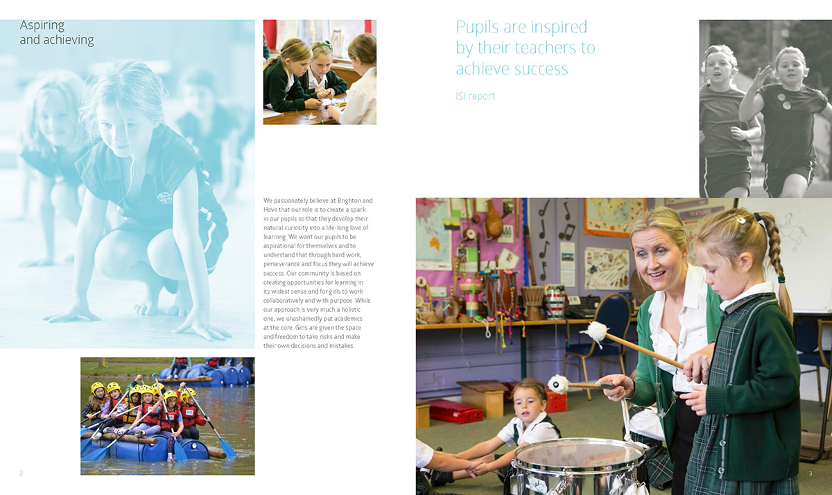
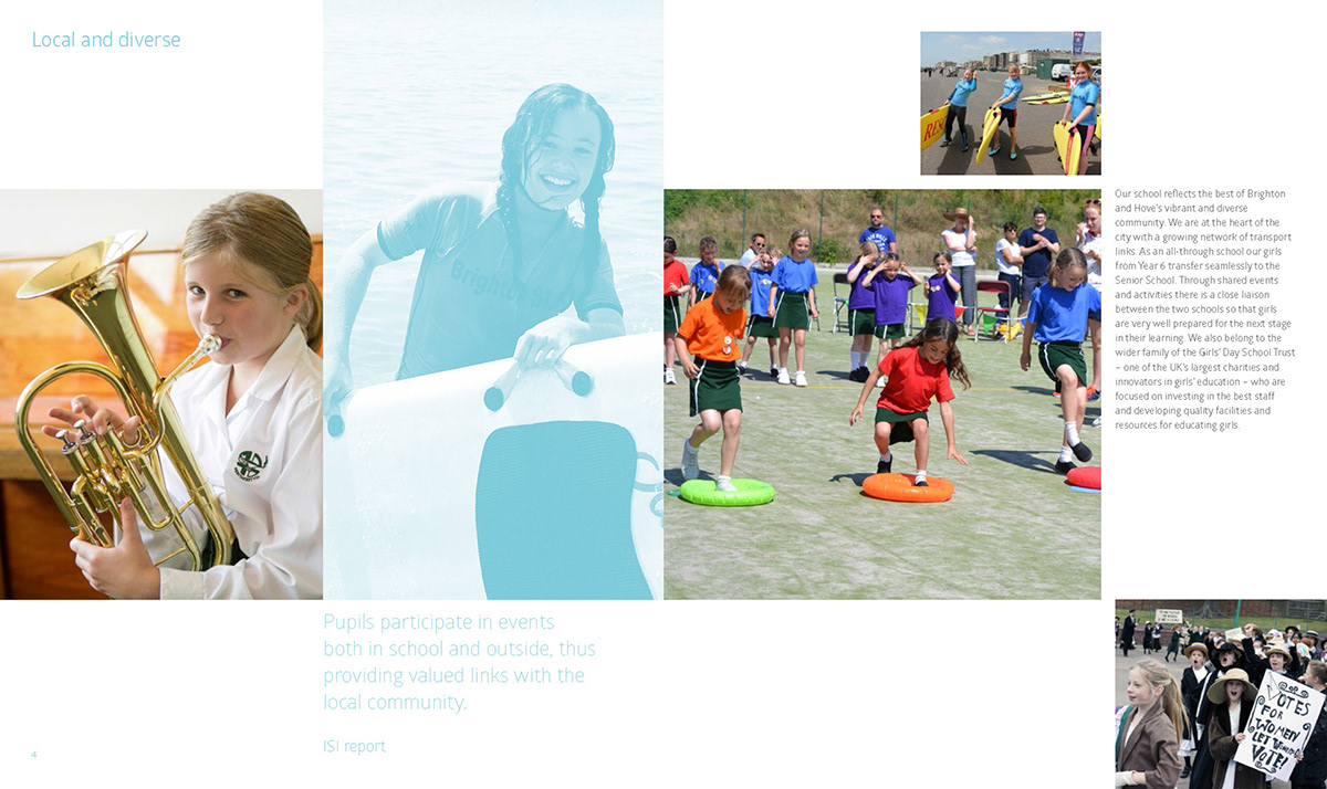
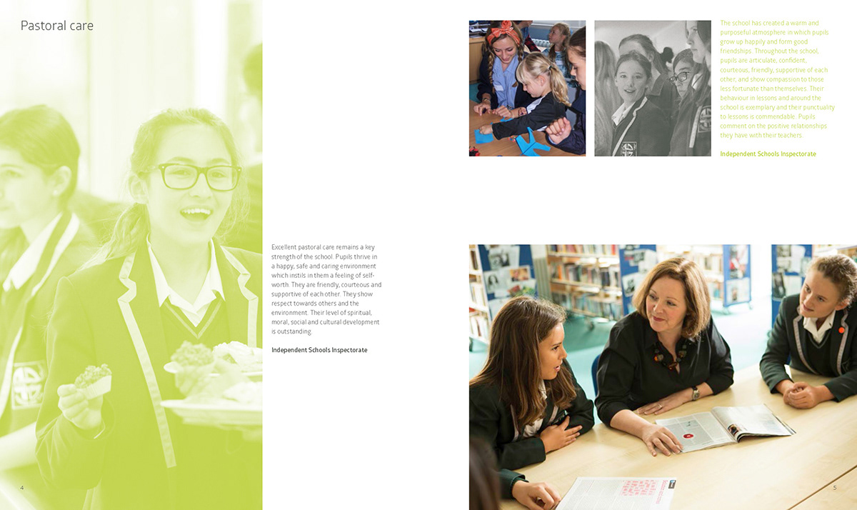
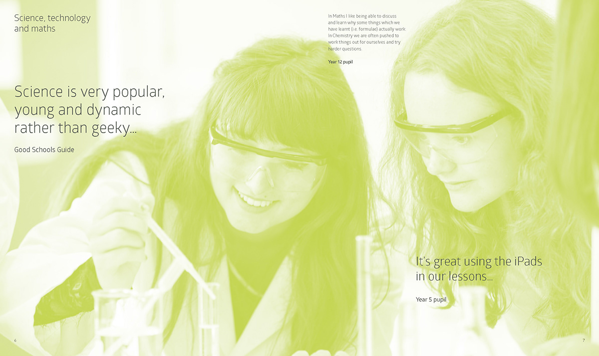
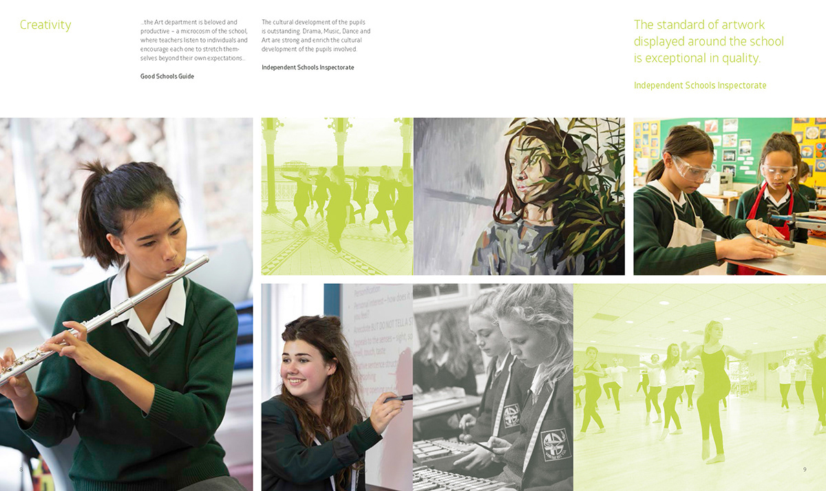
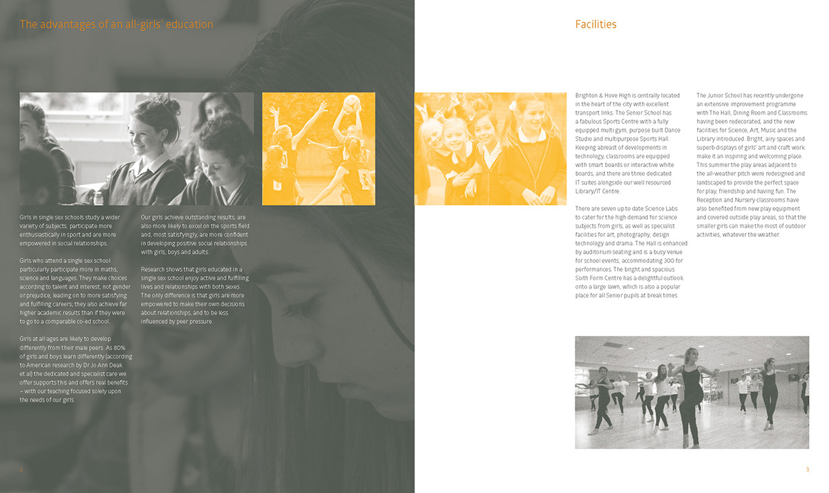
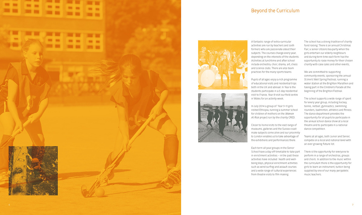
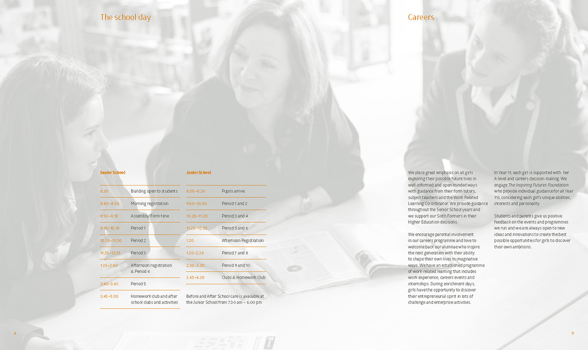
Design of three prospectuses for Brighton & Hove High School describing education and life at the two girls schools – the junior and senior – with a third prospectus describing more detailed information. Each one took a colour theme to differentiate and create the 'family' of communication – the two school propsectuses designed with an emphasis on photography and printed on an uncoated stock, while the information prospectus, printed on a coated stock, went into more textual detail. Each cover was enhanced with a themed colour foil block.